2022
·
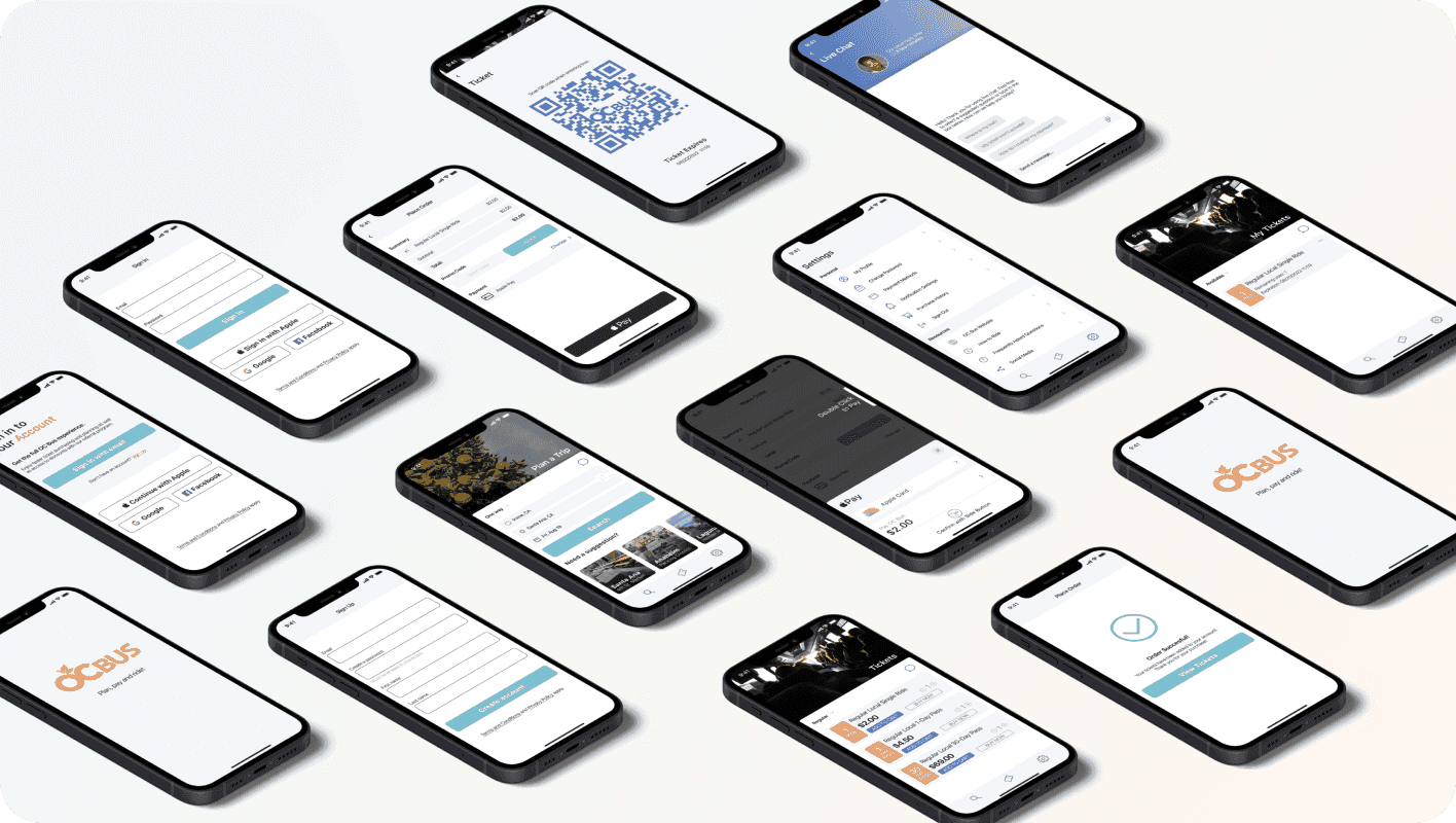
Mobile App
Summary
A redesign of the OC Bus mobile experience focused on reducing friction across trip planning, ticketing, and real-time navigation.
Role: Product Designer
Scope: Research, UX, UI, Prototyping
Background
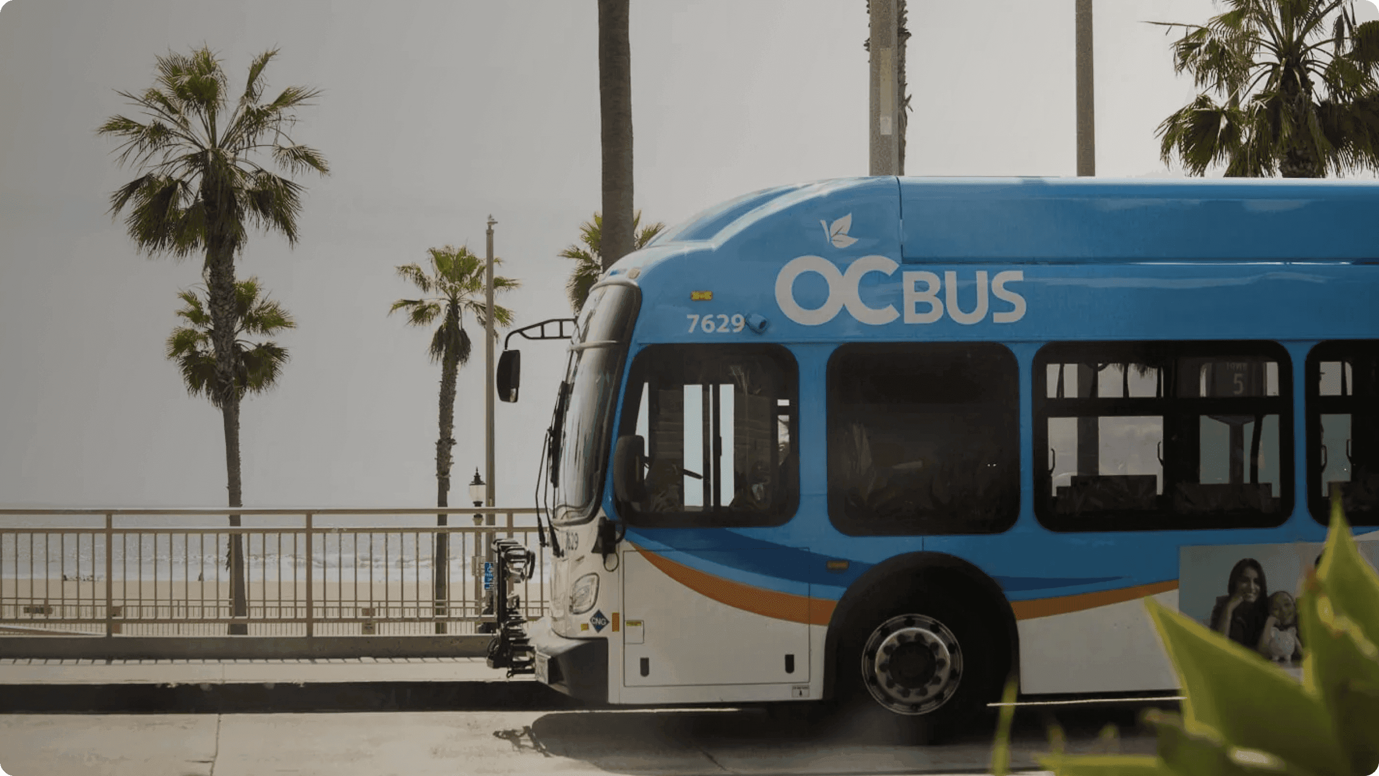
The Orange County Transportation Authority (OCTA) is the public transportation planning body and transit service provider for Orange County, California that has bus and rail transit operation.
It has 58 Bus routes with 5261 Bus stops throughout Orange County, which is 948 square miles (mi²)
The Goal
Design a more reliable and intuitive transit experience that helps users:
plan trips with clarity
purchase and access tickets without friction
stay informed with real-time updates
quickly resolve issues when they arise
Problem
Public transit users were experiencing friction across the entire journey, including:
confusing ticket purchasing flows
unreliable access to purchased tickets
lack of real-time updates and alerts
no direct way to get help when issues occurred
These breakdowns led to missed connections, lost money, and reduced trust in the system.
Solution
I designed a unified mobile experience that:
simplifies trip planning with clear, guided flows
ensures reliable ticket access across devices
introduces real-time tracking and alerts within the app
adds in-app support to resolve issues quickly
The focus was on creating a system users can trust throughout their entire journey.
Research
During the research phase we conducted Surveys, In-Person Usability Test, Current App Responses.
Insights
Individuals have been frustrated with frequent delays and the lack of alerts and ability to get quick help resulting in missed connections.
Ticket purchases expire too quickly and the lack of device syncing resulting in the loss of money, breaks the trust of users.
Many individuals have had problems logging in and accessing tickets and would like to have access to live chat support within the app.
Live tracking is not usable without using an external app like Google Maps.
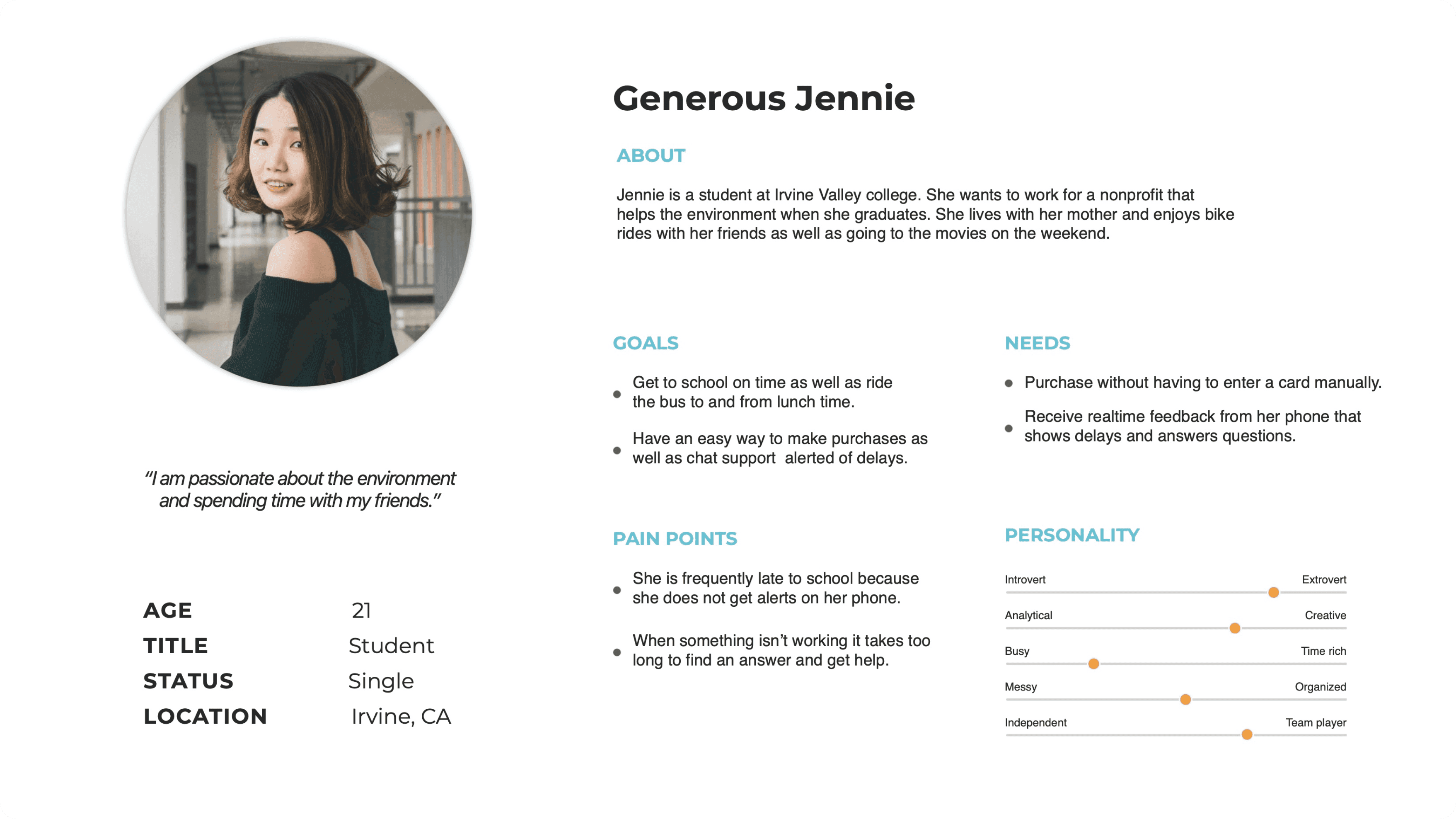
Persona
After gathering and organizing the data from my research, I needed to create personas to visualize the target user. I wanted to ensure that the personas accurately portrayed real bus riders who used the OC Bus on a daily basis. The personas were referred to throughout the entire process in order to remain focused when making design decisions.
MVP Statement
A digital product to plan a ride using easy search suggestions, pay with seamless transactions and ride with ease all in one place while staying up to date, having access to live chat all while focusing on what truly matters to you.
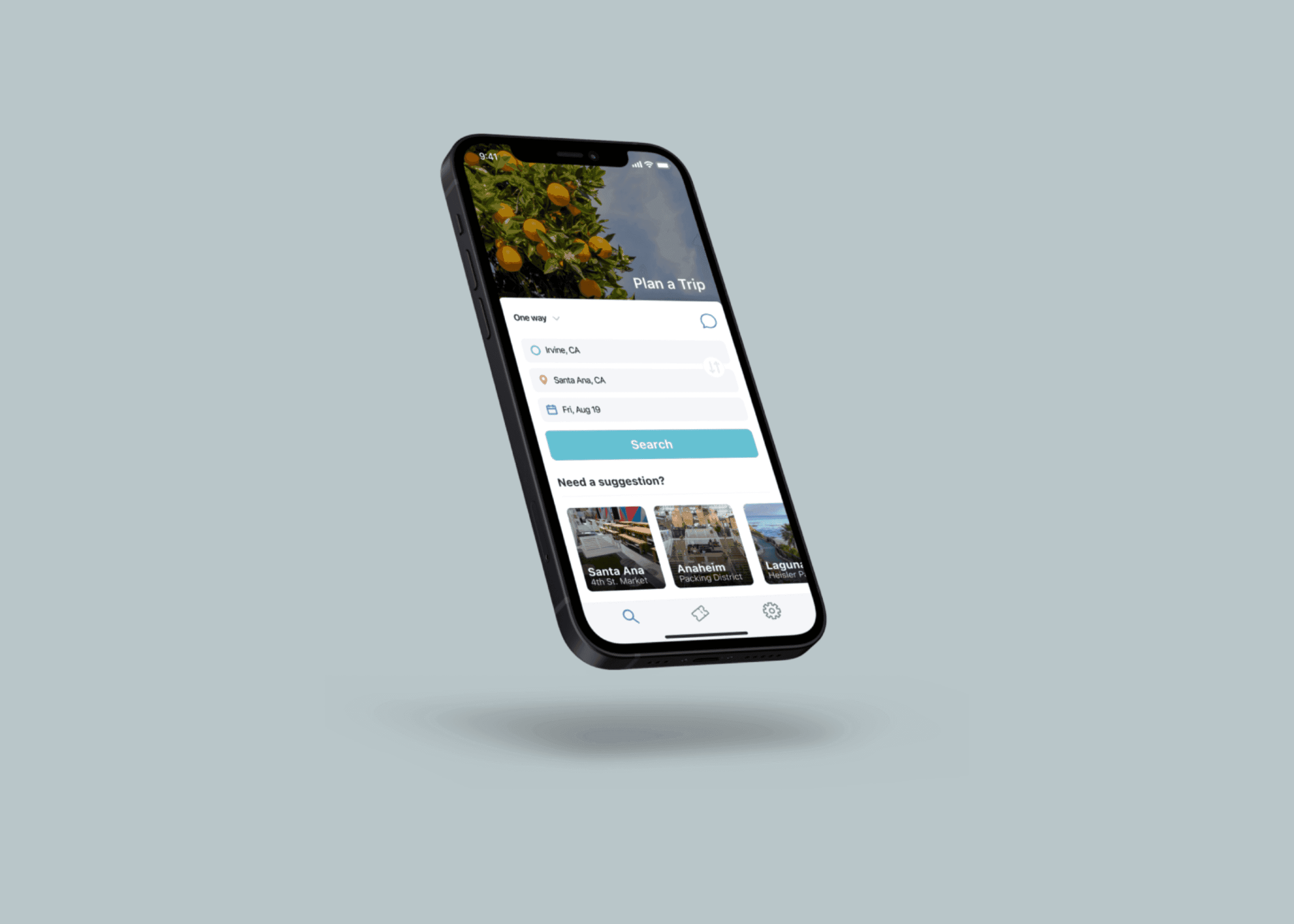
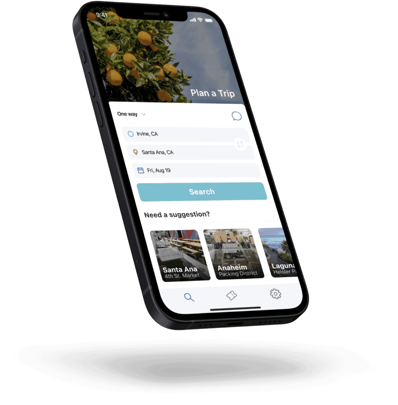
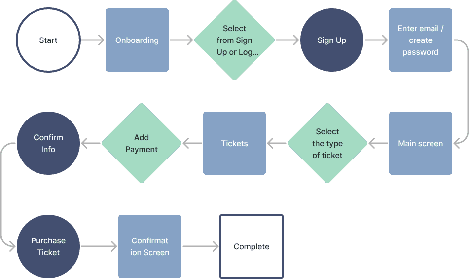
User Flow
We started with a user flow that would allow the bus rider to easily sign up, select the type of ticket they would like to purchase, and then add and confirm the payment.
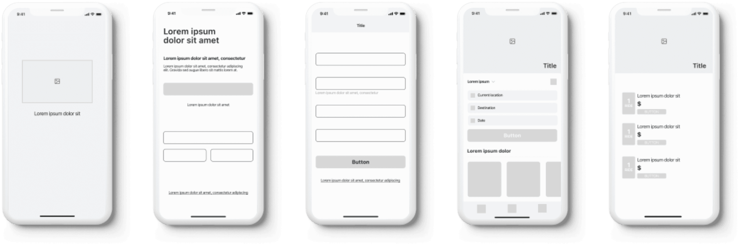
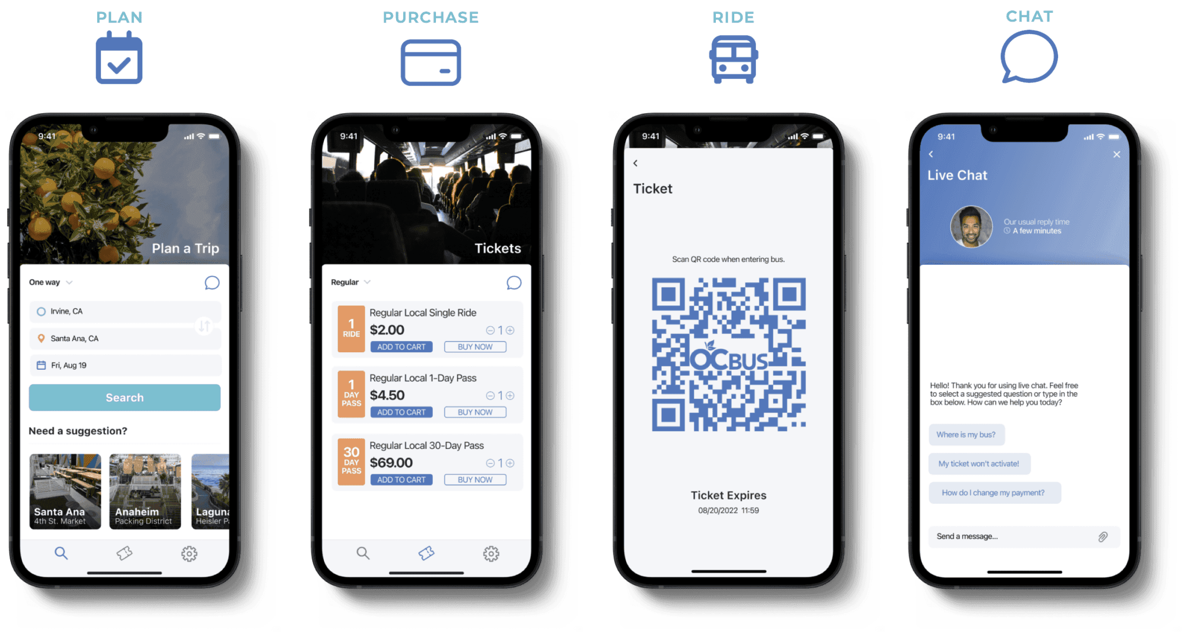
Wireframes
At this point in the design phase it was time to incorporate the research that I had into wireframes. To help visualize how the app should be structured, I created low-fidelity wireframes for the loading screen, onboarding process as well as the plan and ticket screen all in Figma.
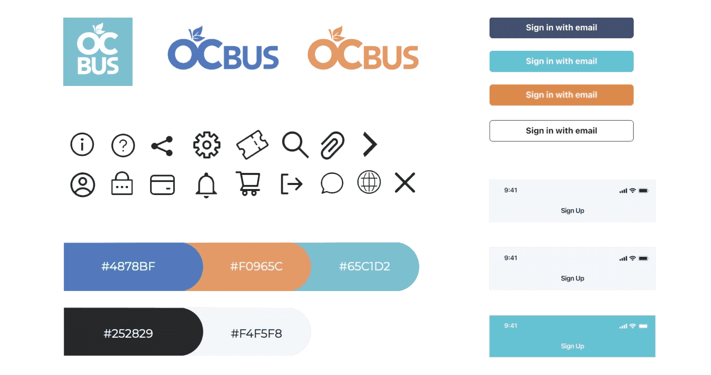
Styleguide
As we put together our styleguide we wanted our different elements to be minimal yet carry a very strong resemblance of the brand colors that already exist for the OC Bus.
Usability Insights
At this point in the process I had a few users try out the prototype as well as have them access the current app so they could better understand the design choices that were made along the way to improve the current transit app.
Takeaways
Re-designing the OC Bus app from start to finish was a great learning experience. The app already existed so it was a nice way to better grasp what other users are experiencing and implement the desired features.